


As you know, securing recurring donations is an excellent way to create sustainable revenue for your nonprofit. While receiving a windfall from a major donor or hosting a particularly successful campaign is a reason to celebrate, setting up something like a monthly giving program or running a recurring donation drive now will give you even more reasons to celebrate in the future.
But how do you encourage a donor to make a repeat donation? One way is to create an infographic and share it on your donation pages and in your appeals.
Using infographics for your recurring donation drives
Infographics convey a lot of information in a short period of time — time that your donor is taking to decide how much and how often they want to give to your nonprofit. The sooner you can convince them how important your mission is and how their donation helps you carry out your mission, the better.
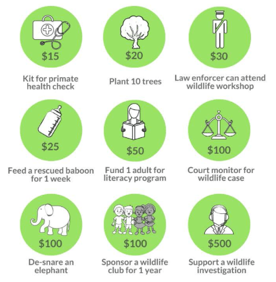
As you can see in the example above, your infographic should clearly lay out what the suggested donation amounts will achieve. When crafted thoughtfully and executed well, this information will encourage the donor to make a larger or recurring gift.
A great example of getting it right is that infographic from the Lilongwe Wildlife Trust. The impact of their conservation drive is clearly displayed through the use of escalating amounts and simple drawings. The design is appealing and easy to understand.
What to include on your infographic
When choosing your donation amounts, organize them from the smallest amount to the largest amount. For each donation amount, highlight the tangible outcome the donation will have on your mission. The more specific you are, the more likely a donor will be to give.
As in the example above, think about how you can use drawings or images to further drive home the impact the donation will have.
Writing specific and compelling copy for your suggested donation amounts
The key here is specificity. Here are a few examples of how to make a more specific appeal.
While saying “$20 supplies mosquito nets” is a step in the right direction, think about how you can add another emotional element to that explanation. If your nets reduce the number of infants who contract and die from malaria, you could write something like “$20 supplies mosquito nets that protect infants from contracting malaria, one of the leading causes of death in the areas we serve.” See how much more that tugs at the heartstrings?
Here’s another example: $50 buys one tent. How can you make an even bigger emotional impact? You might want to describe how the temperature falls in your area during the winter and how many people without shelter succumb to hypothermia. Then you can draw the connection that this tent will help prevent such an outcome.
Creating imagery to accompany your donation amounts
If you don’t have a designer on your team, you can use a free software like Canva to design elements of the infographic or the infographic as a whole. If you have them on hand, you should use inspiring images that show how your team has carried out your mission. Alternatively, you can use a site like Fiverr to find a designer who can help you with your design needs.
Last thoughts
Finally, the only way your infographic can influence donors is if they see it. Make sure you display your infographic everywhere your donors will be prompted to make a recurring donation — on your donation pages, on your home page, etc.
And remember: Keep it simple. The whole point is to get the maximum amount of engaging information into the most user-friendly form possible. Take these recommendations, create a few infographics to test out, and see how they impact the number of recurring donations your nonprofit receives!
This blog post by Nick Wood was published on Bloomerang. Read the original here.