


This post was authored by Sneh Roy (@LBOI) and was originally published under the title “The Anatomy of an Infographic: 5 Steps to Create a Powerful Visual” by SpyreStudios. It has been repurposed here for the C ( Group audience to enjoy.
Information is very powerful but for the most bit it is bland and unimaginative. Infographics channel information in a visually pleasing, instantly understandable manner, making it not only powerful, but extremely beautiful. Once used predominantly to make maps more approachable, scientific charts less daunting and as key learning tools for children, inforgraphics have now permeated all aspects of the modern world.

I designed a couple of infographics back in college, the need arising especially around the time Soccer World Cup fever spiked. It was a fun process representing the different groups, predicting winners in each group at each stage and creating a mock pairing of teams that would clash all the way leading upto the finals. I was a devout Argentinian supporter at the time.
Infographics can appear daunting to some with the sheer amount of data they present, but designed in the right manner and step by step, they can actually be one of the most fun things you will ever create.
Today I am going to walk you through the anatomy of an infographic, its different levels and sub-levels and a 5-step process to ensure that your infographic is not only conceptually sound, but accurate and easily understood.
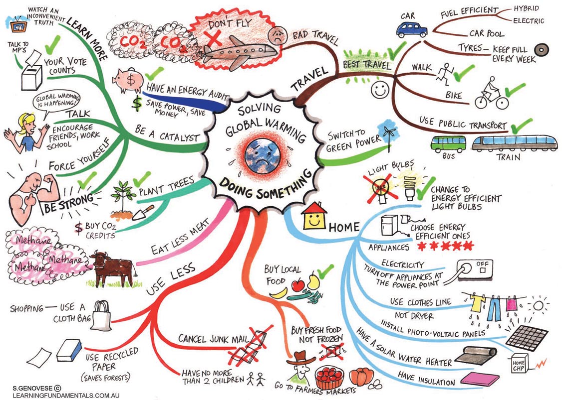
I have used a very simple infographic designed by Jane Genovese of Learning Fundamentals. It is an infographic about combating global warming
Anatomy Of An Infographic
The core infographic is composed of 3 very important parts.
- Visual
- Color Coding
- Graphics
- Reference Icons
- Content
- Time Frames
- Statistics
- References
- Knowledge
- Facts
- Deductions
A One-Level Deep Infographic is a simple infographic barely skimming and brushing through the 3 core parts. It has a visual which is usually common throughout the design. It has some content to compliment the visual. It imparts knowledge based on the visuals and content.The one-level design may incorporate one or two sub-parts from visuals and content but the representation is very basic.
Color coding becomes a must in this type of infographics because visually separating content via color becomes key in relaying information.
A Two-Level Deep Infographic is a more advanced infographic. It encompasses the 3 core parts of the design but delves in deeper. Within the realm of Visuals, the infographic has the thematic defining graphics of the design. In addition it has reference icons to condense and compact a lot of data visually. Color coding becomes a must in this type of infographics because visually separating content via color becomes key in relaying information.
Within the realm of Content, the two-level infographic not only presents factual data, but also makes references and calls on statistics very regularly. There may be additional snippets of data in the form of notes. With the increase in the amount of data as the design goes two-level deep, it becomes very essential to utilize all the graphical resources available to you in the form of icons, image holders, shape groupings, color and time frame integration.
5 Essential Steps To A Good Infographic

1. Skeleton & Flowcharts
Approach an infographic as you would, any other form of design. Put together a skeleton of words and arrows, grouping relevant data together and visualizing the flow of information using flowcharts. Because infographics are usually complex, flowcharts will simplify the process and connect everything precisely for you.
2. Devising A Color Scheme

A color scheme is very important to convey a wide array of messages while keeping the reader confined inside the infographic. With huge and complex infographics, readers will become quickly confused and their perceptions will be scattered all over the place if they don’t have colors tying down their thoughts visually. You can have 2, 3 or 10 colors but assigning them before you begin designing will be the most important thing you do.
3. Graphics

There are two kinds of graphics in an infographic. They are theme graphics and reference graphics.
- Theme graphic is the defining visual of the design and is usually always included in the infographic, except when the infographic is more statistic based. Choosing the right theme graphic will tell you reader at a glance what knowledge you wish to share.
- Reference graphics are not mandatory in the design. They are usually icons used as visual pointers to avoid cluttering up the design when a lot of content needs to be represented. They are brilliantly capable of making numerous references using the same instance. Sometimes words aren’t even necessary if powerful reference icons are used, a practice more and more designers are using in a bid to make their infographics as word-free as possible.
4. Research And Data

It goes without saying that all infographics must be thoroughly researched and the data presented must be backed up by established facts. While doing that, you will inevitably end up with piles of data. Sifting through that you must condense and decide what data is the most relevant and how you are going to present it. The ratio of data to the graphics works best if it is 1:1.
Another extremely important point to remember is demographics. Who is going to be using your infographic? Are they regular office going people who are used to staring at suburban train line infographics or tourists from a non-English speaking country or 10 year old impressionable kids who are being taught to recognize bullying and raise a voice against it. Depending on the demographics, your infographics will accordingly reflect colors, icons, knowledge and complexity.
5. Knowledge

Highlighting important content to easily provoke deductions is an art. As I mentioned before, knowledge is powerful and the imparting of that knowledge must be powerful too.
If your infographic is concentric, having the most important content both visual and factual in the middle is a plus. If your infographic is horizontal, the extreme left and extreme right are the starting and ending points of a reader’s deductions and thoughts, so having your say in those spots will be extremely beneficial. Choosing the right colors and imagery is vital because you cannot show child labor statistics in a subtle yet cheery shade of daffodil. That would just not be right, because sunny yellows are associated with joy and happiness, something that child labor is not.
In the end, an infographic can be as simple and as complicated as you want it to be. A good infographic will not confuse you and make you feel like an idiot, that is a true tribute to the designer designing it. Put yourself in the shoes of the people who are going to be using your infographics and you’ll design a great one!