
Building a nonprofit website is more than having a place where supporters can make online donations. By following nonprofit website best practices, you have a chance to showcase your brand in an impactful way, telling a story that encourages people to give.
Shaping your nonprofit’s narrative through a website requires thoughtful content and user-friendly functionality. Below, we’ll walk you through eight nonprofit website best practices that cover these needs. We’ll also share some nonprofit website examples to inspire you to build a nonprofit website or revamp your existing one.
1. Incorporate an Action-Oriented Modal
A modal on a nonprofit website is a pop-up box that temporarily deactivates the page a visitor navigates to and presents them with an action. The visitor can close the window and return to the original page or choose to complete the action, which returns them to the page.
There are many actions your nonprofit website could include in a modal, such as a:
- Link to registration for your upcoming event
- Streamlined donation form
- Subscription form for your email updates
And since modals encourage immediate action, customers can see a median conversion rate improvement of three points after implementing one on their nonprofit website, according to Classy’s platform data. This ultimately equates to 28% improvement in revenue per site visitor.
Many Hopes, a nonprofit that equips children to become changemakers in their communities, used a modal on its nonprofit website to promote an upcoming gala event. The modal showcased the colorful branding of the event, some quick facts about it (date and location), and a button to click for details and tickets.
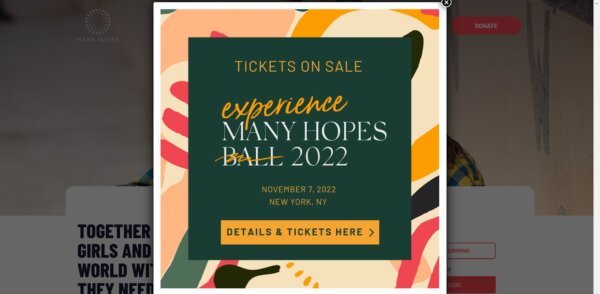
This feature on its nonprofit website encourages supporters to attend who may not have otherwise known about it before. It does so while offering an easy way to navigate to more information.
2. Optimize for Influxes of Mobile Traffic
Based on findings from our annual report, The State of Modern Philanthropy 2022, donors are most likely to land on campaign pages from a phone. Even further, all campaign types receive about half (if not more) of their traffic from mobile.
Given these statistics, it’s best practice for nonprofit websites to be mobile-friendly. This is especially true on key dates like Giving Tuesday, where nonprofits likely see an influx of mobile traffic from social media campaigns, email marketing, and other outreach efforts.
To offer an easy mobile donation experience, ensure your nonprofit website has:
- Reduced required textbox fields when donating for easy navigation)
- Decreased image sizes to speed up page load times
- Clear, bold buttons and calls to action for accessibility
- Increased font sizes and minimal text for easy reading/skimming
- Responsive web design that adjust on any screen size
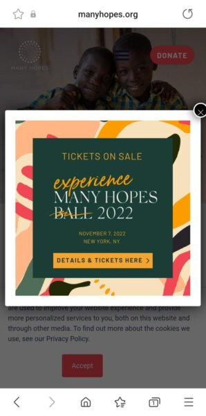
As you can see in the screenshot below, Many Hopes employs a responsive nonprofit web design, so its event modal works on a smaller smartphone screen and a desktop.
3. Spotlight a Clear Donation Button
Your donation button is your primary call to action, so you want your supporters to identify and navigate to it easily. Some best practices for incorporating your donation button on your nonprofit website are to:
- Make it stand out by using a color that contrasts with the rest of your page
- Check that it links to the correct page and that page loads quickly
- Include it on every page of your website, typically as the top header
- Use brief, clear text, such as “Donate,” “Donate Now,” “Give,” “Give Today,” or “Support Our Work”
You can also get more creative with your donation buttons based on different campaign types, such as using impact blocks, pairing them next to a fundraising thermometer, or adding an option to become a fundraiser beside them.
Feeding San Diego, a hunger relief and food rescue nonprofit, includes its donation button at the top of every page via its header. It also includes the donation button as the first call to action on its homepage, next to on-brand imagery and short, impactful text that reads: “Help end hunger through food rescue. Every $1 helps provide two meals.”
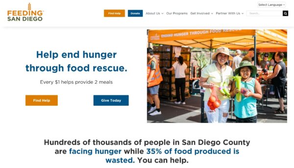
This strategy helps visitors to Feeding San Diego’s website quickly see where and how they can donate. The donate button is also a noticeable blue against a white backdrop and is paired in both locations with a Find Help button of the same size in a contrasting orange color. This draws attention to the area where the buttons are while also putting the nonprofit’s mission of helping people in need front and center.
4. Track Donor Interactions
To know how donors interact with your nonprofit website pages, you can set up a Google Analytics 4 (GA4) property. This allows you to collect data to understand better how your supporters navigate your content and, ultimately, your donation page.
Having this data can inform future improvements to your website, help reveal the days and times supporters visit your site most, and disclose what your top referral sources are. You can learn all about the feature and how to set it up on your nonprofit website through Google’s resources.
5. Include Compelling Visuals
Supporters don’t tend to visit your nonprofit website looking to read a novel. Instead, they want to see and feel your story quickly. You can accomplish a lot of your storytelling through visuals. In particular, you should aim to use:
- On-brand imagery: Use photos and graphics in line with your overall style. For example, if you typically use black-and-white photos, incorporate that same aesthetic on your website. Keeping imagery consistent with your design helps donors identify you.
- Informative infographics: Incorporate infographics to tell your story. For example, if you highlight the top five data points from the past year that show your impact, consider representing each of those measures with a simple graphic.
- Emotionally appealing photos: Choose photos that touch the hearts of your supporters. For example, highlight the people you’ve helped or the animals still in need. You could also select photos that evoke the emotion behind your mission’s work.
Concern Worldwide US, a global nonprofit working to end extreme poverty, uses short videos to fill the banner image on its website’s homepage. These four videos cycle through and show how the nonprofit empowers people through community projects, provides clean water to community members, and offers services to young children. These videos captivate and place website visitors right into the story of its work.
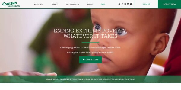
The nonprofit also overlays brief text and a button to learn more on the imagery to move a website visitor straight from the videos into taking action to help.
6. Highlight the Problem Your Nonprofit Solves
When a prospective donor visits your nonprofit website to learn more about your work, one of the first things they want to know is what problem exists that makes your nonprofit necessary. By clearly stating the problem on your website, donors can quickly connect to your cause and whether it’s an issue they want to help make a difference.
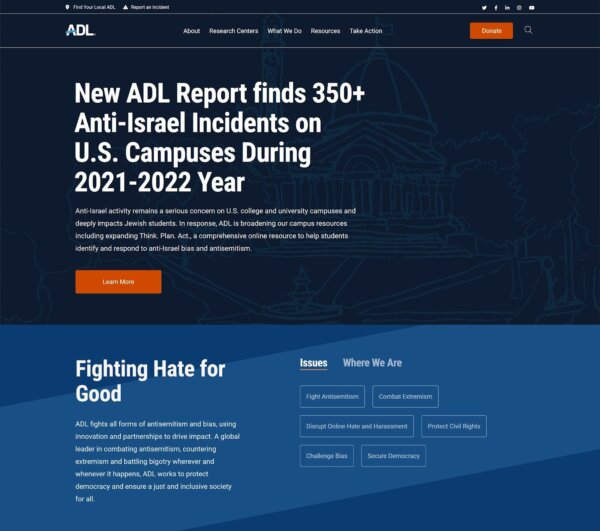
The Anti-Defamation League (ADL), a nonprofit antihate organization, centers the problem it faces by including a recent headline on its nonprofit website that describes documented incidents of antisemitism. You can learn more by clicking the button below the headline or keep scrolling to see more issues ADL works to address. This approach of centering the problem first, helps connect donors to the topic right away by evoking an emotional response to a subject they want to see addressed.
7. Center Your Nonprofit’s Solutions
Not only do visitors to your nonprofit website need to know what the problem is, but they also want to know what you do to solve it. Including highlights of your solutions on your homepage helps prospective donors understand the steps you take to make a difference—and where they fit into that process.
California Central Food Bank, the largest nonprofit food bank in Central California, uses short text on its homepage that touches on the problem but focuses on its solutions for it—how it addresses that problem. The first thing you see on its homepage is: “We fight hunger by gathering and distributing food, engaging in partnerships that advance self-sufficiency, and by providing community leadership on issues related to hunger.”
It also provides an easy way for donors to become a part of that solution, writing that “$1 can help provide up to 4 meals.”
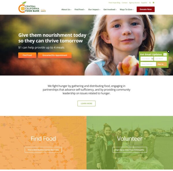
The homepage then includes quick, colorful blocks to navigate for more solutions, including finding food, volunteering, and donating. This approach pulls donors in by showing them how they can be the solution to a problem. Nonprofit websites that take a solution-first approach draw in donors through evoking a sense of hope.
8. Showcase Your Nonprofit’s Impact
Finally, supporters visiting your nonprofit website want to see that you’re accountable in how you say you address a problem. They want to see the impact you’ve already made and your plans for the future. By showcasing key impact data from your work, it helps visitors to your website see their donation to your cause would be a good investment.
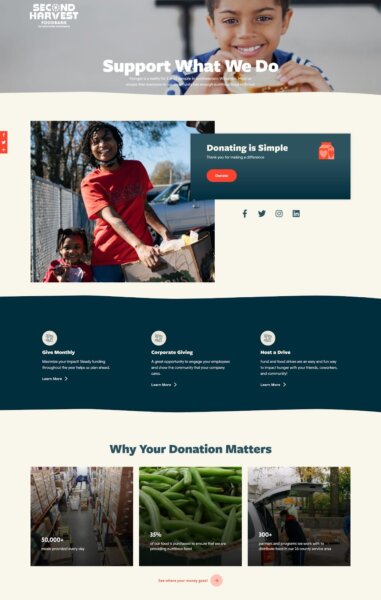
Second Harvest Foodbank of Southern Wisconsin, a nonprofit working to end hunger, uses impact blocks on its homepage highlighting key statistics on how the nonprofit turns donations into impact. For example, it notes that it provides 50,000+ meals daily in a block showing a photo of its warehouse pantry.
Below the impact blocks, it has a link reading: “See where your money goes!” This creates a direct connection for website visitors between their donations and the impact they can have.
Use Nonprofit Website Best Practices to Drive Traffic and Engage Donors
Nonprofit website best practices focus on the user-friendliness of your website and its ability to tell a compelling story about your work. By implementing these strategies, you can help your nonprofit increase engagement with your website and convert more website visitors into donors.
However, don’t stop there—always thoroughly test your website after making any changes to ensure the user experience remains smooth.
This blog post by Korrin Bishop was published on Classy. Read the original here.

